
Oh, alt text. I’ve been asked about it more times than I can count. The question usually arrives with a hopeful pause, as if there might finally be a neat, universal rule that makes the whole thing simple. But alt text has never been simple. It sits in that awkward space between the technical and the visual, demanding a kind of thinking that most reporting workflows never require. And now, with the European Accessibility Act fully enforceable since June 2025, the conversation around alt text has shifted again. Not because the Act suddenly appeared, but because its enforcement changed what is expected of digital products across the EU.
The EAA had been years in the making, but June 2025 marked the moment when accessibility obligations for new digital products and services became real. From that point on, anything entering the EU market that functions as part of a digital experience people rely on must meet harmonised accessibility requirements. This broadened the landscape significantly.
For Power BI practitioners, this doesn’t mean every report suddenly carries legal weight. Context matters. A report embedded in a customer-facing portal may fall under the Act; an internal dashboard used by a small team may not. But the expectation has shifted for everyone: accessible communication is now part of what it means to build a credible digital experience.
Yet the deeper truth is that alt text has always been about more than compliance. It is, at its core, an act of empathy. It asks you to imagine how someone else experiences your work when the visual layer disappears entirely.
Understanding the Context: Where ALT Text Really Begins
Alt text does not begin inside Power BI. It begins much earlier, when requirements are gathered and audiences are defined. We are comfortable asking who the report is for, what decisions it supports, and how often it will be used. We are far less accustomed to asking how the information will be consumed, especially when someone’s interaction with the report differs significantly from our own. Under today’s accessibility landscape, that question is no longer optional.
If one of your stakeholders relies on a screen reader, alt text isn’t a secondary feature. It is the report. It shapes how the data is interpreted, which relationships appear significant, and what conclusions feel reasonable. Every omission, every emphasis, every vague description contributes to the mental model being formed. In that sense, alt text becomes a matter of responsibility, a commitment to ensuring that insight is not dependent on sight.
Translating Insight, Not Describing Pixels
Writing meaningful alt text requires clarity about purpose. A generic description of a bar chart rarely provides value. What matters is the insight the chart is designed to communicate, the comparison it highlights, the shift it reveals, the story it tells.
This forces a deeper question: Is the insight itself clear enough to be expressed without visual cues? If not, the problem isn’t the alt text. It’s the design.
Without a clear understanding of user needs, alt text easily becomes either too superficial to be useful or so exhaustive that it overwhelms rather than informs. The goal is not to replicate the visual; it is to translate the meaning.
Leveraging Power BI: Dynamic ALT Text Through DAX
Static descriptions rarely scale in dynamic reports. As soon as slicers change or the underlying data refreshes, manually written alt text can quickly become inaccurate, misleading, or simply out of sync with what the visual is actually showing. In reports that are designed to be explored rather than read once, this becomes a significant limitation.
Power BI’s support for conditional formatting in alt text fundamentally changes this. By generating descriptions through DAX measures, alt text can adapt to the current state of the report. It can reflect filtered values, highlight selected categories, and summarise trends dynamically as users interact with the data. It also bypasses the 250‑character limit imposed by manual entry, allowing for more nuanced explanations without forcing artificial compression or vague phrasing.
At this point, alt text stops functioning as a static label and becomes part of the report logic itself, an intelligent layer that evolves alongside the data rather than lagging behind it.
Tools like Copilot can help accelerate this process, particularly when translating existing measures into readable sentences or assembling multiple values into coherent descriptions. That said, automation should support judgement, not replace it. Drafted text still requires careful refinement to ensure clarity, tone, and relevance, especially when the visual is complex.
For example, one DAX measure I use to generate dynamic alt text for a precipitation matrix chart identifies the months with the highest and lowest rainfall and updates the description automatically based on the user’s selections. This is a dense visual, and my first question when approaching it was not how do I describe this heat map, but what is the primary message someone should take away from historical precipitation averages.
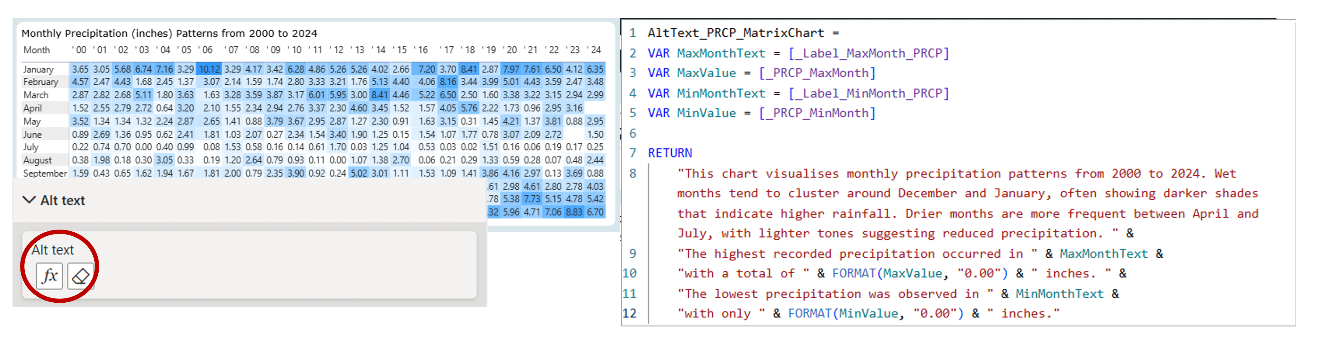
In this particular case, my background in physical oceanography makes that question feel relatively straightforward. But that familiarity is precisely the point. When we are working with subjects we know well, it is easy to overlook how much implicit understanding we bring to the table. When the subject matter is less familiar, or when the audience has different priorities, it becomes essential to first understand the metric, the process behind it, and the needs of the stakeholders using the report.
By using DAX in this way, alt text becomes less about describing visuals and more about communicating insight. It shifts from a static accessibility requirement to an integral part of how the report explains itself.
Recently, I’ve also been experimenting with DAX user‑defined functions (UDFs) to make alt text more reusable across visuals and reports. The idea was simple: if we can centralise logic, we can reduce duplication and maintain consistency as reports evolve. The experiment was promising, especially for standardised narrative patterns, but my final conclusion was that UDFs still require careful curation, they can support good alt text, but they can’t automate the thinking behind it. If you’re curious about the full breakdown, I’ve documented the approach at Automating Alt Text in Power BI with DAX User‑Defined Functions. You can also explore both UDF examples on GitHub at Power BI Alt Text UDF Library.
Testing and Validation: Experiencing the Report Differently
Testing is often the most revealing step. Using tools such as Narrator in Windows 11 forces us to experience our report without visual scaffolding. It quickly exposes where alt text is too vague, too verbose, or simply absent. Interacting with slicers while a screen reader is active provides immediate feedback on whether dynamic descriptions behave as expected.
But technical testing is only part of the process. Feedback from users who rely on screen readers offers insights no automated tool can replicate. Asking whether descriptions feel clear, whether important context is missing, or whether certain sections are unnecessarily complex often uncovers gaps that were invisible during development.
Alt text proves its value not when it exists, but when it genuinely supports understanding.
Wrapping-Up
Alt text is not a one‑time task. As reports evolve, as audiences change, and as business questions shift, descriptions must be revisited and refined. Treating alt text as a living component of the report, rather than a compliance checkbox, makes it far more likely to remain accurate and meaningful.
And perhaps most importantly, alt text reminds us that accessibility is rarely about perfection. It is about intention, iteration, and the humility to recognise that some aspects of design demand more empathy than we initially expect. Feeling uncertain or imperfect in this work isn’t a sign of failure. It’s a sign that you’re engaging with accessibility at the level where it becomes less about features and more about perspective, and where good design becomes inseparable from responsibility.
To support this ongoing process, I’ve also created an Alt Text Checklist, a simple, practical reference you can use while designing or reviewing reports. It’s meant to help you slow down, ask the right questions, and make sure your descriptions consistently serve the people who rely on them.
Thank you for joining me on this journey. Until next time, let’s keep crafting accessible and ethical insights that make a difference!


