
Accessibility is something I advocate for constantly, especially when it comes to colour contrast. Yet every time the topic comes up, there’s always someone who believes contrast is just a matter of “choosing colours that look okay together.” Apparently, it’s not “technical enough.” So this time, instead of explaining why colour contrast matters, I decided to show just how technical it really is, by building a fully WCAG-compliant Colour Contrast Ratio Checker inside Power BI using nothing but DAX. No external tools, no custom visuals, no shortcuts.
This project turned into one of those wonderfully nerdy pieces of work where accessibility, mathematics, and DAX logic all meet in the middle. It also reinforced something I firmly believe: accessibility isn’t a “nice-to-have”, it’s engineering, and it deserves the same level of technical consideration as any other part of a report.
Why I Wanted the Calculation Inside Power BI
Colour contrast is easy to get wrong and even easier to assume you’ve got right. When we’re designing a report, it’s tempting to rely on intuition, especially when working within a corporate colour palette. But WCAG contrast thresholds are strict for a reason: they ensure that text can be read by people with a range of visual abilities, on different screens, in different environments.
The traditional workflow, jumping between Power BI and external contrast checker tools, is inefficient and interrupts the design process (I could hear Seven of Nine from Star Trek Voyager saying that!). We end up copying hex values back and forth, re-testing each time we tweak something, and hoping we don’t miss a case. I wanted to eliminate that friction. By moving the calculation directly into Power BI, the contrast check becomes part of the design itself, not an afterthought. Once logic lives in the model, it can be reused across reports, embedded in theme development, or even surfaced for designers who don’t want to deal with formulas at all.
Breaking Down WCAG’s Luminance Maths
Before writing a single line of DAX, I had to revisit the WCAG specifications and break down how relative luminance is actually calculated. The contrast ratio formula looks deceptively simple, but everything depends on accurately computing luminance, which is where the real complexity sits.
WCAG defines relative luminance using gamma corrected RGB values. That means each colour channel (red, green, and blue) must be transformed in a nonlinear way depending on whether its normalised value is above or below a specific threshold (0.03928).
Each channel is normalised to a 0–1 range, then run through this formula:
- If the channel ≤ 0.03928 → divide by 12.92
- If the channel > 0.03928 → apply the (X + 0.055) / 1.055 power 2.4 transformation
After that, the luminance is calculated using WCAG’s weighted coefficients:
L = (0.2126 × R) + (0.7152 × G) + (0.0722 × B)These weighting factors matter because human vision perceives green as much brighter than blue, and slightly brighter than red. When you’re trying to meet contrast thresholds, these subtleties make all the difference.
Translating HEX > RGB > Luminance in DAX
DAX doesn’t have native colour functions, so the first challenge was extracting RGB channels from a hex colour string. This meant working with MID, LEFT, and RIGHT in combination with UNICHAR and VAR blocks to isolate and convert each component.
From there, I converted each hex pair to decimal, normalised it by dividing by 255, and applied the branching gamma correction logic. This was the moment I realised just how many nested variables I’d end up creating. But once each corrected channel was calculated, assembling the relative luminance formula became surprisingly ok.
Finally, the contrast ratio itself uses the familiar WCAG equation:
(L1 + 0.05) / (L2 + 0.05) where L1 is the lighter colour and L2 is the darker. DAX needed a final step to determine which luminance was larger and structure the formula accordingly. Once that was done, the ratio could be returned as a simple numeric result, ready to feed into the logic for WCAG AA and AAA checks.
From Calculated Columns to a Reusable UDF (and a Power Query Function)
My first implementation of all this was through calculated columns, one for both the foreground and background tables. This worked fine and produced accurate luminance values, but it also meant the WCAG luminance logic was duplicated across the model. I also wanted something cleaner and far more re‑usable.
So I decided to package the entire luminance calculation into a DAX User‑Defined Function (UDF), as well as a custom function in Power Query.
This opens up two options:
- A DAX User‑Defined Function (UDF) that performs
“HEX → RGB → Gamma Correction → Luminance”
in one place, and - A Power Query custom function, for people who prefer doing the calculation during data prep.
This gives two flexible workflows:
- Dynamic luminance and contrast directly in DAX
- Or precomputed luminance from Power Query (super useful when parsing theme JSON files)
With this setup, you can load your organisation’s theme JSON, extract every colour, calculate luminance once, and evaluate contrast instantly across entire palettes.
1 – DAX Implementation: The HexLuminance UDF
With the UDF in place, the model becomes beautifully simple to work with. The Foreground Luminance measure just takes the currently selected foreground hex and runs it through the UDF; the Background Luminance measure does the same for the background hex. The Contrast Ratio measure then reads those two luminance values and applies the WCAG formula. In other words, the UDF is the engine, and the three measures (Foreground Luminance, Background Luminance, Contrast Ratio) are the clean, reusable interface you use everywhere in the report.
How to use the UDF in your report
You will need to create two separate tables (disconnected), one containing the HEX code for the foreground and another for the background. The UDF measures compute luminance dynamically as the user selects colours. The contrast ratio measure feeds into all WCAG AA/AAA pass/fail logic.
If you want to edit the template available for download, open Power Query and manually change the HEX codes on the tables Colour_Background and Colour_Foreground. The matrix will refresh automatically.
2 – Power Query Implementation: Luminance as a Custom Function
If you prefer to handle colour work earlier in the pipeline, especially when you’re extracting palettes from a theme JSON, the Power Query version mirrors the same logic.
How to Use the Power Query Function
- Import your theme JSON
- Extract your colour fields
- Invoke the custom function
In Power Query UI: Add Column → Invoke Custom Function
- Input column:
Hex - Function:
fxHexLuminance
You’ll get a Luminance column (values between 0–1). Use the measure to calculate the Colour Contrast Ratio.
You will need to duplicate the table with the HEX codes, so you have two disconnected tables listing the HEX codes, one to be used for the background colours and another for the foreground. Than you still need to use DAX to calculate the Background and Foreground Luminance and Contrast Ratio.
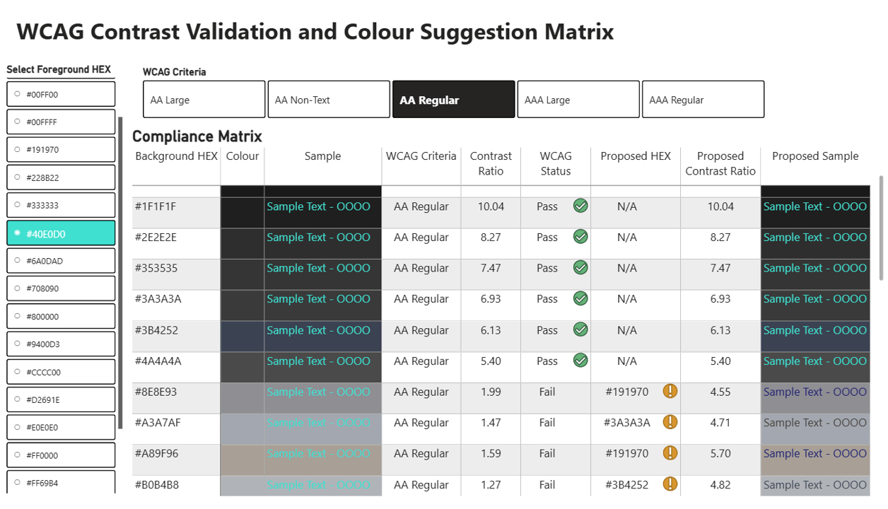
Building the WCAG Tests in DAX
Once the contrast ratio was in the model, the WCAG checks were just logic. Each test compares the ratio to the relevant threshold and returns a clear “Pass” or “Fail”:
- 4.5:1 for AA regular text
- 3:1 for AA large text
- 3:1 for AA non-text graphical elements
- 7:1 for AAA regular text
- 4.5:1 for AAA large text
Each measure returns a clean “Pass” or “Fail,” which is then paired with icons, descriptive text, and colour formatting in the report. None of these measures are particularly complicated on their own, but they elegantly tie the maths back to realworld design decisions. Someone choosing a colour combination doesn’t need to understand the luminance formula, they only need to know whether their colours work for their intended purpose.
Making the Checker Practical: Suggesting the Nearest Accessible Colour
One of the most helpful additions to this checker actually came from a conversation at SQL Konferenz in Hanau, when a colleague casually said, “Wouldn’t it be great if it also suggested the nearest colour that actually passes?” And honestly, he was right. A tool that only says “Fail” isn’t very empowering. A tool that tells you what to do next is far more useful.
So, I added a second step to the model: whenever a foreground/background pair fails the WCAG contrast requirement, Power BI now suggests the closest alternative HEX colour from your palette that does pass.
Behind the scenes, this uses a small UDF that calculates the colour distance between two HEX values. It converts each colour into RGB and measures how visually close they are. That means if a colour needs adjusting, the checker won’t push you toward something random or unrelated, it chooses the nearest option that still satisfies the WCAG threshold.
It’s a small piece of logic, but it completely changes how the tool feels. Instead of ending with “Fail,” the model guides you toward an accessible, visually consistent alternative, which makes the entire experience far more practical for real report design.
Download the Template
If you want to explore the full logic, adapt it for your own report designs, or build your own palette validator, the complete Colour Contrast Ratio Checker is available for download.
The template includes:
- the HexLuminance UDF
- all luminance, contrast and WCAG AA/AAA test measures
- the Colour Distance UDF and HEX suggestion measures
- the Power Query fxHexLuminance custom function
- a ready-to-use UI with colour pickers, ratio displays and pass/fail indicators
- support for importing your theme JSON to automatically extract your organisation’s colour palette
Everything is already wired up, so you can immediately plug in your colours, test combinations, and integrate the logic into your own design workflow.
A Note on APCA (Advanced Perceptual Contrast Algorithm)
There’s strong indication that the W3C is evaluating APCA as part of the work toward WCAG 3.0. Compared to the ratio‑based WCAG 2.x method, APCA is perceptual, polarity‑sensitive, and typography‑aware, which makes it more realistic but also more complex to implement in DAX or Power Query.
While WCAG remains today’s standard, APCA signals where contrast modelling is heading: a more perceptually accurate, user‑centred view of readability.
Compared to the relatively simple WCAG 2.x contrast ratio, which is based on gamma‑corrected luminance and a single mathematical formula, APCA is significantly more complex. You can find more details about it here.
I will soon work on implementing APCA in Power BI as well, so watch this space!
Wrap-up
Building this tool reinforced something that often gets overlooked: accessibility is deeply technical work, not a decorative afterthought.
By implementing WCAG’s luminance and contrast calculations directly inside Power BI, using a DAX UDF and a Power Query custom function, contrast checking becomes part of the model, not an external step.
It brings three big advantages: the luminance logic is reusable in one place; theme integration is simple (import JSON and test colours programmatically); and design feedback is available to everyone using the report, not just the people writing formulas.
I’ve also published the full solution, including the DAX UDF, the Power Query luminance function, the PBIX example, and sample palettes, as an open-source release.
You can download it here: GitHub Release v1.0.0
Thank you for joining me on this journey. Until next time, let’s keep crafting accessible and ethical insights that make a difference!


