

Happy New Year! As we kick off 2025, let’s dive into an important topic. I’ve been following many data challenges on LinkedIn recently, and it’s amazing to see how much creativity and effort people put into their dashboards. The variety of approaches is incredible, but one recurring issue keeps catching my eye: the lack of white space. It’s something many people overlook, especially when just starting out with BI tools, but it can make a world of difference in how a dashboard or report feels and functions.
White Space as well as alignment are fundamental principles that transform user interface design from cluttered to polished. White space, or negative space, is the empty area around the elements on a page. It’s not wasted space, it’s where clarity lives. It gives your design room to breathe and ensures that your message doesn’t get lost in a sea of information.
I’ve noticed that many dashboards try to do too much at once, every inch packed with charts, tables, and text. While it’s natural to want to include as much insight as possible, this approach can overwhelm the user. By intentionally incorporating white space, you can guide your audience through the story your data is telling. It helps key metrics stand out, improves readability, and, most importantly, makes the experience less exhausting for the viewer.
Think about it this way: a dashboard isn’t just about what you’re showing; it’s about how someone feels when interacting with it. Too much clutter can frustrate or even alienate your audience. But a dashboard with thoughtful spacing feels approachable, professional, and focused.
The images below show two versions of a “Supply Chain Performance Summary” dashboard. Take a look at Image 1 – notice how the cluttered layout and poor use of white space and alignment make it harder to read and interpret the data? It feels like everything is crammed together, right?
Now, compare that to Image 2.
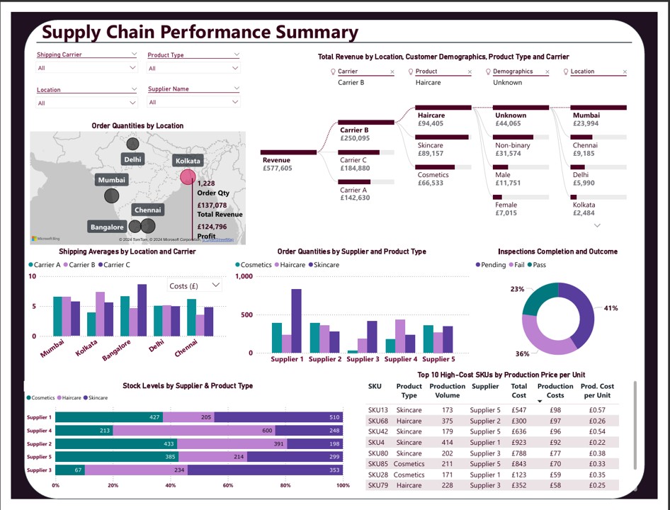

Can you see the difference? With better use of white space and alignment, each visual element is carefully designed to have a purpose and tell a story. The data is presented in a much cleaner and more organised way, guiding the viewer through the insights effectively.
Which one do you find more engaging and easier to understand? I bet Image 2 caught your eye! This is the power of well-thought design, where every visual component contributes to a coherent and compelling narrative.
White space also plays an important role in accessibility. For individuals with low vision or neurodivergent users who might find cluttered layouts overwhelming, well-spaced designs are much easier to navigate and understand. Thoughtful design is key as it ensures that your work is comprehensible and appreciated by everyone.
When I create dashboards, I try to remind myself of the power of simplicity. Not everything needs to fit on one page. Margins, consistent spacing, and even removing unnecessary elements can transform a design. It’s a skill that takes time and practice, but the results are always worth it.
So, to those diving into BI tools or looking to refine their dashboards, I encourage you to take a step back and embrace white space. It’s a subtle change that can have a profound impact. If you’re eager to put this principle into practice, consider participating in the Data Visualisation Challenge Data DNA, an excellent platform to refine your skills and experiment with innovative designs. You can find more details clicking here: Data DNA – Dataset Challenge – Onyx Data.
I’d love to hear your thoughts, how do you approach white space in your designs? Have you struggled with striking the right balance?
Thank you for joining me on this journey. Until next time, let’s keep crafting accessible insights that make a difference!
I’m on YouTube now!
Check out Accessible BI for practical Power BI tutorials and tips on making data accessible to everyone. Subscribe here: Accessible BI YouTube Channel


[…] Want to learn more about white space? Check out my post about it Elevate Your Dashboard Design: Harnessing the Magic of White Space. […]